-
Spanish Film Festival. Málaga
Festival rebrandingUntil its seventh edition, the logo and trophies of the Malaga Film Festival bore no relation to one another. So to strengthen the festival’s identity, we suggested unifying them under one symbol, the biznaga malagueña, which is a floral adornment consisting of a dried thistle stem and its spikes, onto which closed jasmine buds are attached that blossom the next day. Thanks to this single graphic element all the competitions, displays and competing films in each of the sections and events can now be easily identified.


-
Barcelona Museum of Contemporary Art
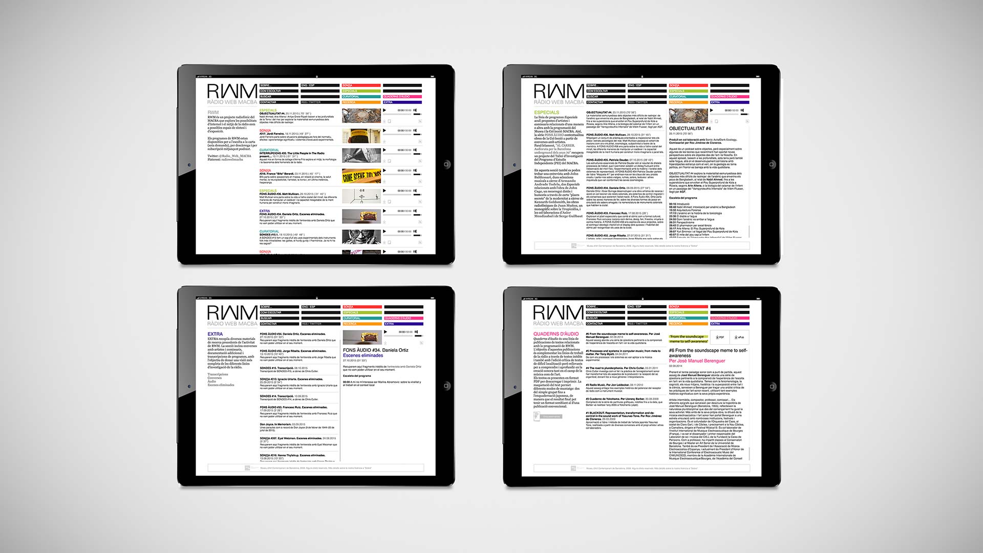
Ràdio Web MACBARWM is a MACBA project that explores the possibilities of Internet radio as a space for synthesis and exhibition. You can listen to RWM programmes by streaming, downloading, or subscribing to podcasts. We drew inspiration for RWM's visual identity from the frequency waves of graphic equalizers and their mesmerizing "visualization" of sounds. For the website's design, one of our top priorities was to make navigation around the growing number of programmes and the vast archive of sound works primarily intuitive.
-
TBB. Berlin
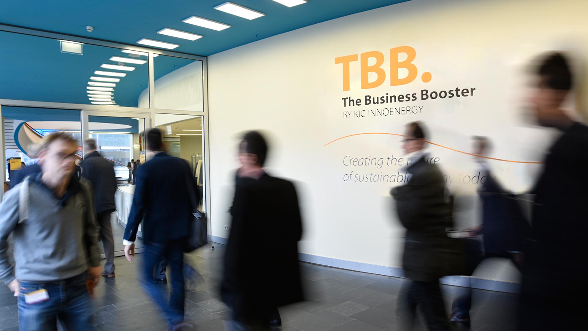
Branding for an event on energy innovationThe acronym TBB, which stands for “The Business Booster”, is the name of an annual event in support of energy innovation. It rolls off the tongue, which is why we chose it as the polestar for all the event's different communication areas: identity, signing, printed and merchandising materials and booths. We chose orange as the common colour bringing together the various elements, and adopted a wavy line, which we dubbed "the energy curve”, to identify InnoEnergy, the company that organizes TBB.
-
ESADE Business School, Barcelona
Organized yet flexible identityWhen we were asked to design a book with the brand gidelines of ESADE, we set out to create a manual that was technically impeccable yet easy to use for people, unfamiliar with graphic design. What we came up with was a style guide that clearly defines and sets out the basic elements of ESADE's visual identity while allowing sufficient flexibility for its users to apply the brand mark with creative freedom, consistency and structure.
-
Casa Marcelo, Santiago
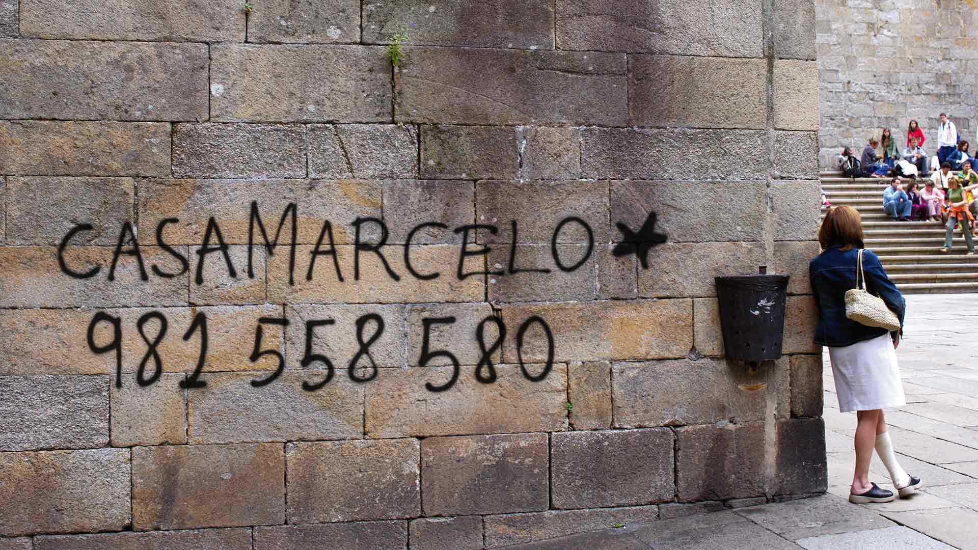
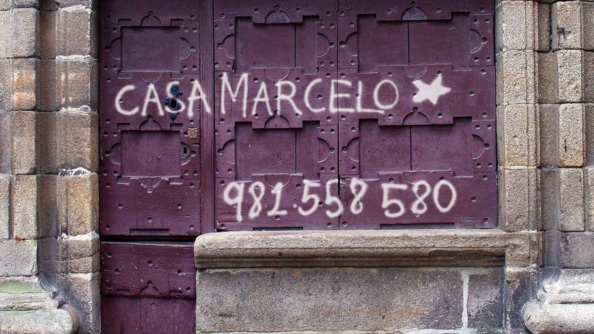
The Edge of IdentityMarcelo Tejedor’s avant-garde restaurant is in the historic part of Santiago de Compostela, a monumental enclave built entirely of granite with centuries of history behind it. The brand identity we created for Casa Marcelo —graffiti-like letters on the city's ancient walls— combines the two features that best define his cuisine: innovativeness and the ability to reinvent local traditional gastronomy with large amounts of creativity. The corporate image thus combines the historical essence of the city with a somewhat rupturist, irreverent and even loutish wink of the eye.
-
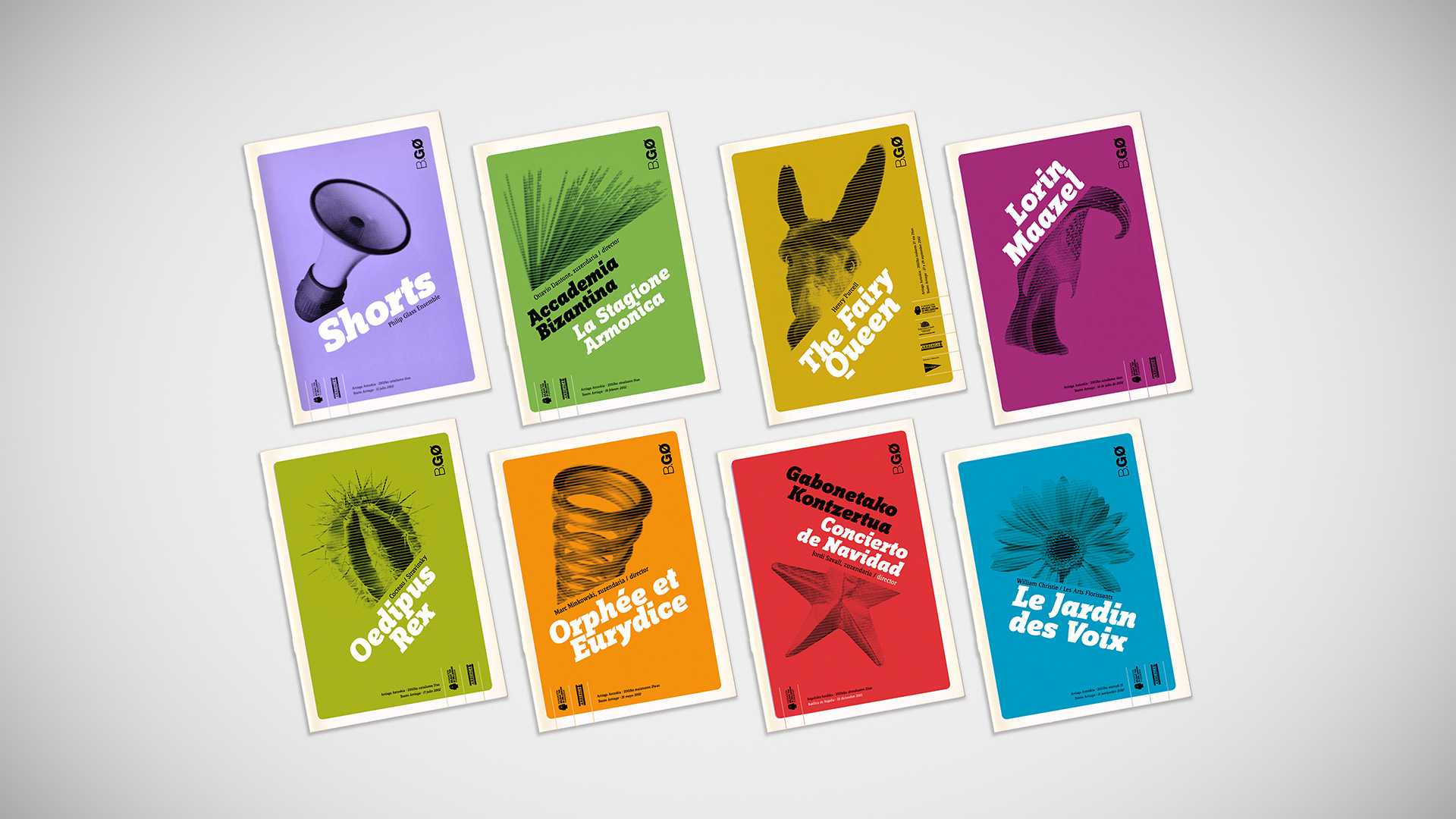
Bilbao City Council
BGØ. Bilbao Zero GravityBilbao City Council asked us to create a common aesthetic for the various artistic representations (opera, theatre, music...) programmed for 2001 under the name of “Bilbao Gravedad Cero”. So we came up with a logo for a generic name, B.GØ, to be used on all media. We then went on to define the brand guidelines in the posters and programmes, which showed symbolic objects that we photographed in such a way that the orthogonal axes and shadows disappeared, making them look like they were floating in space, as the programme’s name suggests.